If you change the way you look at things, the things you look at change.
Showing posts with label house. Show all posts

Friday, July 4, 2025

Happy Independence Day!


From our house to yours.


Thursday, April 10, 2025

Projects - Kitchen Window Treatment


I did a little refresh on the kitchen recently. After seeing lots of block print fabrics featured in home decor, I decided to update the kitchen window treatment with a block print fabric. I shopped online and found a print I liked that I thought would cheer up the windows in the kitchen. Then, I ordered just enough to create a faux Roman shade for the two windows. I also ordered a nice print to use for trimming out the edges.

My fabric came from Spoonflower and I paid full price. I was not compensated by the company in any way. The fabric I chose is called Handblock Medallion 6 Blue on Whitney White Fabric. The contrast that I used for trim is called Indigo Blue Painted Chevron Herringbone. I ordered a length of both fabrics that was two yards in length. The fabric was 58 inches wide. I neglected to make photos along the way. So, I've created some diagrams to illustrate as best I can.


To begin, I measured the width of the window and added an inch. Then, I trimmed the selvage edge off of one side and cut the medallion fabric that width, plus one inch to allow for seam allowances. Next, I cut the fabric in half so that I had the same length for both windows. Then, I gave both pieces a quick pressing to get the wrinkles out. 


I trimmed the selvage edge off one side of the herringbone fabric, measured and cut 2 pieces that were a seven inch width and the full length of the fabric. These two pieces would form the trim for the sides of the shades.


Then, I measured up seven inches and cut a strip of fabric that was the full width of the fabric. And repeated that process so that I had two seven-inch strips that were a wee bit wider than the width of the medallion pieces. These two width pieces would form the trim for the bottoms of the shades.


I folded the two lengths that would form the side trim in half with wrong sides together and pressed. This resulted in two strips that had a folded edge on one long side and two raw edges around the other three sides. Then, I folded the two widths in half with wrong sides together and pressed. This resulted in two widths hat had a folded edge along one side and two raw edges around the other three sides.

Now it was time to assemble the shades. I placed one of the folded strips on the left back side of the medallion piece and the other folded strip on the right with the folds toward the center of the medallion piece. The cut edges of the medallion piece and the folded pieces were flush with one another.


Then, I stitched down both sides using a half-inch seam. Next, I pressed the seam allowance toward the front of the medallion fabric. Then, pressed the herringbone fabric over to the front of the medallion fabric.


Then, I stitched along the fold of the herringbone fabric. The stitching is 1/8th of an inch from the folded edge. That encased the raw edge of the seam inside the trim.

The next step was to trim out the bottom of the shades. So, I lined up the raw edges of the widths of the herringbone fabric to the raw edge of the bottom of the in-progress shade, leaving about an inch overhang on each side. The herringbone strip is on the back side of the shade-in-progress.

I stitched the bottom trim to the back of the shade-in-progress using a half-inch seam. Then, folded and pressed the seam allowance toward the medallion fabric and folded and pressed the trim piece toward the center of the shade.

Next, I stitched along the folded edge of the bottom trim 1/8" from the fold. Then, I folded the raw side edges under twice to encase the raw edges inside and stitched those edges down as well.

At the top, I created a rod pocket by cutting a four inch strip of the herringbone fabric. I laid this strip atop the shade with right sides together and I stitched a half inch seam, making sure to have at least a one-inch overhang on each side.


Then, I folded the side edges over a half-inch and then a half-inch again and stitched that edge down to enclose the raw edges.


Next, I folded the raw edge of the rod pocket under a half-inch and pressed it. Then, I folded the rod pocket strip over to the back and pressed the seem connecting the rod pocket and the shade down to have a crisp edge with none of the herringbone fabric showing on the front. 

I stitched the folded raw edge down to create the tube on the back to hold the curtain rod, stitching 1/8" from the folded edge. Then, I stitched a line across the shade from side to side one inch above that. This gave me a nice little header above the space where the curtain rod would slide through.


This method left me with no raw edges and a smooth completed finish. After that, I determined how deep I wanted the folds of the shade to be. I sewed a small plastic ring at the fold near the edge of the shade for each 'pleat' that I wanted folded up. Then, I sewed another plastic ring on the opposite side near that edge and another ring in the center. Finally, I cut a short piece of cording and tied the rings together to form the folds. I ran the curtain rod through the rod pocket and hung the shades.


I decided I liked the look so much that I also wanted a faux shade above my sink. However, I didn't have a wide enough piece of the medallion print to fit the window. So, I took the piece that I had and matched the pattern to form a strip wide enough to go across the window. I finished the sides and the bottom the same way I had for the large window shades and hung it on a tension rod pushed between the cabinets.


The window treatments seemed to finish off and add a cheerful note to our updated kitchen. Even the mister commented that he really liked the new look!


Sunday, January 28, 2024

Livening Up a Grey Room with a Roman Shade

Grey is a bleh color to me when it comes to decorating. I have hated the trend that everybody has been fond of - painting everything a neutral grey. To me it seems cold, dreary, depressing, and institutional or prison-like. So, I was not thrilled years ago when my mother-in-law had the walls and cabinetry in the basement painted grey. Knowing that it was to be her space, I did not want to object and really wanted her space to be her own. Now that we are reclaiming that space and repurposing it to meet our needs, I am learning to live with the grey as best I can. The paint is still in really good shape and I just cannot justify having it covered over just because it is not my favorite. So, I am looking for ways to live with it but liven it up.

One of the grey walls in the basement.

We recently began to turn one of the front basement rooms into an office. I need a dedicated work space, since I still work from home many days. I will also want an office-type space even after I retire. I will want a space for bill paying and working on our farm paperwork. I will want a space for writing as I want to write a book similar to the one I helped my mother to put together as a way to share her lifetime memories with our children. I will want to have a space for sewing and crafting when I take on creative projects.

So, I began to look for ways to liven up the grey room and make it more friendly. I decided that an easy way to get started with that would be to add a decorative window treatment. I knew that I didn't want to cover the window because I want all the natural light I can get coming in through the window. There are blinds for controlling the sunlight where it won't be glaring in and blinding while I work at the desk. 

My first thought was that I wanted to add pretty floral panels to the sides of the window and make the room rather feminine. Then, I realized that might not be a possibility because the window is not really centered on the wall allowing for a full drapery panel on either side of the window without covering any of the window. On the right side, there is about three inches and on the left, there is considerably more space.

So, I started turning through the pages of my 'house look books' and surfing the net and saving ideas. I began to notice a trend in what I was collecting. They seemed to all have some sort of floral Roman shade that draws the eye up but brightens and livens up the space. The inspiration I seemed to keep coming back to was this office with a Jacobean print shade and incorporated the greens and blues that I have going on in the room already. 

So, my next turn was to dig through my fabric stash and see what I already had that might work to combine the color scheme I had started. Remember that I am trying to do this office on a budget and I want to use as many things that we already have as possible. I have a pair of pillow covers made of a Jacobean print that I first bought to try to work into a bedroom with my grandmother's cross-stitched quilt. The fabric turned out to be a bit too creamy or lean too far toward yellow. So, I made a couple of pillow covers that I use in the den and hung the rest of the fabric on a hanger to keep in my stash.

When, I pulled it out, I realized that it might just be the perfect fabric. It has the hunter green color that is found in the green check chair and it has a nice sky blue color that would brighten things up as well. So, I quickly decided that I ad found my fabric to use in the office. When I started measuring and planning, I realized that I was going to have to seam a couple of pieces together to reach all the way across the double windows. So, I gave my friend, Kathy, a call. She made thousands of window treatments over the years and I knew she would be a good resource. Of course, I watched dozens of online videos as well! The two that wound up being my strongest resources were How to Make a False Roman Shade and How to Make a Roman Shade

Kathy suggested that I might not want to have the seam running down the middle of the window because that might draw too much attention to it. After I sent her a hand full of photos, she told me that I might not need to worry about the seam showing because there was so much going on in the fabric and I might be able to match the print quite well. So, I went to work.

I measured my windows and measured my fabric and used the instructions provided by the YouTube videos. Then, I stretched the fabric out across the floor and ripped one end to get a straight edge. I know that isn't recommended for all drapery fabrics due to the width and the nature of the fabric's weave. It is just something I feel better about when I am sewing. A straight edge makes my life easier. Then, I began to stretch out the next run of fabric to match the print for the seam.

Matching it up was pretty easy. In my mind, I was thinking I would just sew the two pieces together to make a tube. Then, I would split one of the runs of fabric so that I had a seam on both sides and the center panel would be one run of the fabric. As it turned out, that match up wouldn't work out for me so well. So, I decided I would stitch the two together and see out the seam turned out. 


Kathy suggested that I press under one of the fabric's selvage edges to make the matching a bit easier. Plus, I could just stitch along the fold of the pressed edge and my seam would probably be easier and nicer to match up. It worked beautifully!

The fabric panel on the right has the selvage pressed under 
and the two pieces are pinned together to match the print.

With excitement, I stitched the two pieces together and gave the entire thing a nice pressing. 

Then, I turned to the other selvages and sides and realized that it wasn't going to work out as a had envisioned. The edges and the print was not matching up as I'd thought it would. So, the beauty of having this space is - I could walk away from it and leave it out for a while to decide what to do next. I ordered some trim tape to cover the seams and thought that might be the way I would go. 

At this point, I was going to have to make the shade shorter or have less folds 
or cover the seam somehow because the sides were not matching up as I'd hoped.

The more I thought about it, the more I began to think that the print of the fabric was not going to show the seaming as obviously as I had worried it might and I wouldn't need to do anything for it to be camouflaged it at all. So, I just decided to cut one side off and press the seam out and stitch the lining to the fabric. Then, hang it and hope nobody noticed the seam.

Close up of the seamed fabrics

As it turns out, that was the right thing to do in this case. The shade looks nice in my office and really adds some life and pulls the colors I'm using in the room together.

I love how it brightens the space and looks feminine and cheerful.

Even with the sunlight streaming in, the seam is not obvious at all. And if somebody is nosey enough to look and see if there is a seam, they will just have to find it!


Sunday, January 21, 2024

Primary Bath Update - Progress to Finish

Like any good project, this one started with a collection of ideas and inspiration. My drawings seemed like everything was going to come together well. Now, it was time to put those ideas into practice!


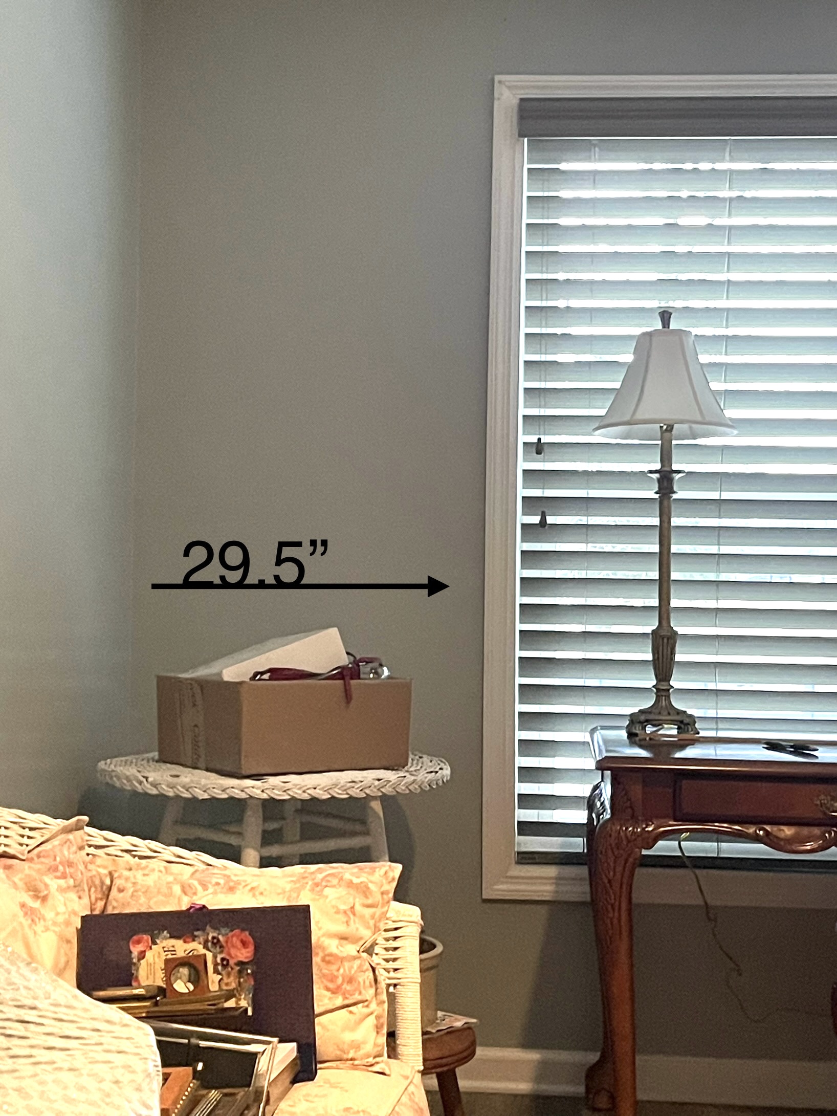
Here is where we started:


The front half of the bathroom has hardwood floors, a tiny linen closet and vanity on the right of the entrance and a doorway into a large walk-in closet on the left. The toilet is straight ahead and sits on square biscuit colored tile from the 1980s. The walls were paint over wallpaper. Painting took place in the early fall of 2009. 


The vanity was serviceable but rather dated - especially because of the counter and sink. The vanity top was a preformed sink and counter of cultured marble and there was a builder-grade mirror glued to the wall. The light sconces had been swapped out by yours truly several years ago when one of the previous ones had stopped working. The linen closet was tiny but also a very serviceable area.


The tub and toilet were biscuit colored and the square tile surrounding the tub was the same. It all was still in working order but stained from years of use and a struggle to keep mildew away as evidenced by the bleach cleaner that always sat on the side of the tub. 


We decided not to change the footprint of the bathroom because it works alright for us. I had thought about expanding into the large closet that is adjoining the bath but decided that there was really no need as this layout really did work alright for us and making major changes would increase the cost but would also just mean more for me to keep clean and I am not one who loves to clean.

So, Richard from The Tool Chest and his trusty assistant, Faye, showed up on a Monday and demolition began! I was at a school that day and the Mister oversaw all the production from his recliner after he had returned from one of his physical therapy workouts for rehabbing his new left knee. When I returned home, here is how things looked at the end of day one.


The toilet, tile, and cast iron tub were all gone! Everything had been swept up and hauled away in readiness for the new installation to begin the following day. The sink, vanity top, and mirror were also gone.


We had decided to keep the vanity because it still was in good shape and we really didn't want to change anything about it except to clean it out and organize it a bit and I had a plan for that. However, we decided to update the sink, faucets, countertop, mirror, and lighting throughout the bathroom.

The next day found Richard working on the prep stages of adding backer board and plumbing for the new shower faucets.


I had chosen a 'shower kit' that features a manmade stone that looks like marble for the walls and a textured version of the stone as the base of the shower. Remember my inspiration that was crafted from large slabs of stone? Well, rather than real marble stone, we were giving this unknown product I had stumbled upon during my search a try. I had ordered everything sight unseen, having faith in my online shopping capabilities. Everything was delivered just before Mike's knee surgery and we stored it all inside his livestock trailer and parked it in the tool shed until Richard was ready to begin. So, a day or so later meant Richard was installing this newfangled product that was still in the shipping package. The big box store had links to a video created by the company which demonstrated how to install. We watched with rapt attention a couple of times and then Richard plunged right in. 


Two of the stones are in place in the photo above. Richard decided to add a bit of pressure to ensure that they stayed in place overnight. So, the two by fours stretching across from the opposite wall were added as shown below.


I have photos of the different pieces and parts being installed but didn't include each and every step in this post - believe me! The next photos show the shower installed and the grab bar and faucets in place.  


Richard had to drill holes into one of the end stones to provide for the faucets. We opted for the "car wash" effect, according to the Mister. There are four jets which push water out onto the torso and are great for my aching back. A favorite is the rain effect of the overhead faucet. Somebody likes to pull the bench right up under it and sit for a while! Then, there is also a hand-held wand-type faucet for targeting different spots and I like it for cleaning the walls and floor of the shower, too.


Next, came the installation of the shower doors. While everything I had chosen was pretty much traditional in style, it all sort of leaned toward a farmhouse vibe - or at least I hoped so. However, I had chosen the Frameless Contemporary Sliding Shower Door with Rain Glass and the word contemporary had me a bit worried. My thought behind this was that it looked sort of like a barn door in the way it slid across, but more importantly, it seemed to have less nooks and crooks to clean since it is frameless. Plus, with the rain glass, I hoped it might not show hard water buildup and gunk so much. So, while things were moving along swiftly enough, Richard was thoughtful and had the shower where we could use it as soon as possible. We were only without a convenient shower for a couple of days. For that short time, we used the smaller shower stall in our basement.


The 'shower kit' came only with the four stones for the wall as well as the base and the drain cover. The grab bar, faucets, shelf, and door, of course, came separately.


One of the things that the Mister really wanted when we were in the planning stages was a shower bench. This 'shower kit' did not have such an option. So, I searched for something that would serve as a shower bench that reached all the way across the width of the shower but seemed sturdy and would be easy to clean. I first looked at teak options. Then, this one popped up in my search. I figured it would be easy to clean and I thought the size would be ideal. I didn't realize how sturdy it might be. The bench has turned out to be one of the best parts of the new bath! It is the perfect size, is sturdy and would be hard to tip over, and it is really simple to clean with a quick little scrub.


Next came the tile for the floor. This had been the first thing I picked out when I saw it years ago. Then, when it was delivered, I fell in love all over again. At this point, though, I was a little worried that it might turn out to be too busy with the veining in the shower stones and the vanity countertop and the pattern of the shower door. Then, having the differences in the marble pieces of the basket weave tile...I knew as soon as I peeked over Richard's shoulder when he had about half of it set in place that it was exactly what I wanted! 


When he asked me what color grout I wanted, I quickly told him that I wanted it to match that small square tile and look about the color of dirt. Muffa, my paternal grandmother, when I was a young girl in college and was setting up my own abode, told me, "Get a rug that has coloring that is close to that of the dirt in your yard. That way the rug won't have to be swept as often." I knew after all these years that it was sound advice!


One thing we added to the bath that I thought would tie it into other parts of the house was the bead board wainscoting. The guest bath has that and I've always really liked it. 


So, using that as a pattern, Richard added bead board and trim. He and Faye suggested that I also add it to the space behind the vanity and I am so glad they did. It really made things more cohesive and added that little extra punch to frame out the vanity.


The new countertop with undermount sink was installed along with the faucet. While there is a wee bit of difference in the look of the stone that is the countertop and that of the shower, the wall between the two really makes it hard to notice. All of the different stones just seem to blend together and look cohesive in spite of being different and having been gathered together without my having laid eyes on the actual products. Sometimes it is better to be lucky than good!


The electrical work in the update included swapping out the plugs and switches from beige to white, moving and installing the new sconces beside the mirror, and replacing the light and exhaust fan near the shower. I chose the fan/light because it was mostly enclosed and should be easy to keep clean with just a swipe of a duster or the vacuum tip. The vented slots of the previous one had gotten so gunky that it was gross and impossible to clean. So, hopefully the design of this one will prevent that. It also has the added feature of a night light option, which is nice during those middle of the night visits. The sconces I had originally ordered were too wide for the new mirror I'd had made. So, Faye and I did a quick online search and order and they were available to be installed within a couple of days. 


We also had Richard install a couple of grab bars just for safety's sake. I want to feel safe when Mike has his second knee replacement. Plus, we are senior citizens! I didn't want the industrial looking grab bars, though. So, this short grab bar just outside the shower and the mid-sized one beside the toilet which match the longer one inside the shower are what we used. They look very similar to the bath hardware I ordered. Somewhere along the way the towel bar got lost or maybe it was never delivered. So, I followed Faye's suggestion of hanging three hooks across from the shower instead.


The finish work is really the details that make the difference. The drywall, wainscoting, trim, and crown molding are painted White Dove by Benjamin Moore in a satin finish. The ceiling is the same color but is a flat finish. The vanity is painted in a high gloss finish using Blue Stream by Benjamin Moore. I chose this soft blue color with the help of the consultant at our local Ace Hardware Store. My thought is that when we paint the adjoining bedroom, it will be in the same pale blue color in a satin finish. I ordered custom knobs via Etsy for the vanity to give it a jewel box look, but I see that they are not available now. They are Mother of Pearl with silver detail. 


I decided to order sidesplashes because our original vanity had those. When I was searching for that, I stumbled across another size. Remember my inspiration picture that had the little marble shelf on it? I decided to order this longer length of the backsplash to give it a try as a shelf. I just had to figure out how we were going to mount it because the faucet I had chosen would not allow it to rest on the backsplash. I did a search to find a small corbel and landed on this one. Richard and Faye painted them to match the bead board and it really elevates the vanity area.


The mirror is made from an antique frame that my mother gave me. I knew that I wanted to use it if at all possible because I love the chunkiness of it and the patina of the wood and thought the warmth of the wood might warm up the vanity area as well as continue that farmhouse look. The sconces also add to that aesthetic, I think, with their oval base and candle look.

Once all the lighting was installed, I felt like I needed a bit more light in the vanity area. So, I ordered this pendant that was on sale at the time. It really did the trick and brightened things up just as I had hoped. It blends beautifully with the paint color and is really just the right size. I may give the 'candles' a quick paint job, though because I think they need to be a bit whiter to look more like candles and like the sconces. 


Earlier this week I stitched up a little window topper. I got this fabric and am so pleased with it! I had ordered a new curtain rod with a sweet finial to hang it with but I am going to have to have a taller helper to get the rod installed. In the meantime, the topper is suspended on the old-fashioned curtain rod that was originally there. 


I will have to share how I did some organizing and updated the inside of the vanity and linen closet to make it even more of a workhorse for this room in another post. I know this post is long but what is an update if we don't have a bit of before and after?

 
Standing in the doorway

 
Front of Shower

 
Back of Shower

 
Vanity Area

We could not have asked for a better outcome! Richard Stanaland from The Tool Chest and his trusty assistant, Faye, did fabulous work and completed the entire project quickly in a two-week timeframe. The updated bath is everything I envisioned and more! I smile every single time I step inside it. I've already started dreaming of the next project that Richard will do for us and we have our fingers crossed to get it done this summer.


Note that all of these photos were made with my phone. They are the raw footage that I snapped each day when Richard and Faye were finished working. 

(We were not compensated for any purchase related to this project. I included the links to products and the installation company as a courtesy to any reader for seeing exactly what product I am referencing.)