I guess I'm a little like Bunny Williams in that I'm having An Affair with a House. I generally try to get a project or two done when I'm off work. So, this week, one of my projects was to work on getting the guest bathroom closer to being done. (Of course, when it comes to decorating a house, are we really ever done?)
I know that the all-over-floral wallpaper was probably a really popular look when it was first decorated in that way. I love, love, love the bead board and the beautiful white oak floors. I also like the creamy white trim and vanity. So, the bones of the place satisfied me - just not the wall treatment. Knowing that it was functional, I put off re-vamping it till all the other upstairs rooms were painted and well on their way to being 'done.'
I went paint shopping and landed on a color that my daughter has accused me of trying to make everything in my life be like. Bridgette calls it tan but I like to think of it as my friend, Kathy, suggested - neutral. The actual paint color (I think) is a Martha Stewart color that I got at Home Depot called Buckwheat Flour. So, after a couple of coats of paint, the guest bathroom turned out looking like this
Several people tried to discourage me from doing it, but I simply painted right over the wallpaper. Yes, if you look closely, you can see where the seams are, but that doesn't bother me nearly as much as ripping the paper off, tearing up the drywall, and having to repair or replace it would have. I really love the calm, neutral color of the paint and it is a relaxing place to be. Here is a little closer look at the wallpaper before:
The shiny gold light fixtures, mirror, and accents on the faucets and towel bars were not really to my taste either and those antler-ish looking things might have been intended as towel hooks. They are wrought iron that has been painted white. They came down. (I still have them but don't know what to do with them.) Here is a look at the same area right after the paint was dry. (Guess what season of the year it was.)
The above picture gives you a good look at the shiny gold mirror and drawer pulls. My friend, Kathy, had recently removed the knobs off her kitchen cabinets and replaced them. So, I became the happy recipient of her
So, I have really gone from having a busy, patterned, floral guest bathroom, to a very neutral one. Of course, I have pieces of my blue and white there. I mean, after all, that goes with anything!
The lotion dispenser on the right is one I picked up for a buck at the local Historical Society fund-raiser yard sale last summer. The cup with the granddaughter's toothbrushes is one I picked up at a yard sale years ago and relegated it to being a holder after I chipped it. The soap dispenser is one of those cheap foaming ones that I simply used a fabric scrap and Mod-Podge to spruce up a bit.
On the wall above, I followed my gallery wall philosophy of using inexpensive black frames and placed one of the note cards my Granny had sketched in it. The O initial I got at Hobby Lobby on clearance for a few pennies and the plate is one I picked up at a tag sale somewhere for pennies.
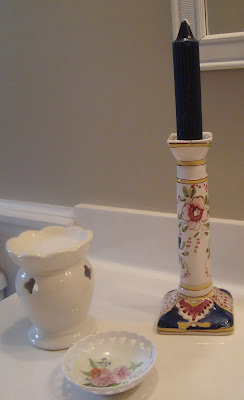
On the other side of the vanity is a candle holder that I picked up at a tag sale, a
Three Longaberger baskets hold some English Ivy cascading down beside the window. The beach scene is an oil painting I got at a starving artist sale one time. On the tub ledge is a pair of silver candle holders (another student gift), more blue and white, and a rubber ducky family for the granddaughters' bathtime enjoyment.
The artwork opposite the mirror is one of those The newest metamorphosis is found overhead - the shiny light fixtures are no more! My friend, Kathy, came over to coach me through that project on Wednesday. (I forgot to get a 'before' photo with them on the wall.) Here is how they were when we began to transform them:
Here is an even closer look at their shiny-ness.
First we gave them a coat of bronze paint made by Rust-Oleum
but that simply made it look like a metallic brown and I was looking for something richer and with more depth. So, for the second coat, we used Krylon Oil Rubbed Bronze.
This gave it a sheen, a satin look, that is sort of a cross between black and brown. I just love it!
I just love the luster and the richness of the color. The pictures cannot do it justice!
Not only was this a fulfilling project that made a huge improvement to the look of the bathroom, but it was super easy! The only part that was difficult is that one person had to be downstairs flipping breakers while the other was upstairs watching to see when the light went out. After that, it was easy peasy!
I still would like to get silhouettes of the granddaughters to hang in there (You may remember that I have tried this once HERE.) and reprint photos of the children in a sepia tone to hang with them. I may get some molding to beef up the mirror and paint it to match the light fixtures. I think it really will be complete then...well, till I find another great idea in somebody's blog or on Pinterest!


No comments:
Post a Comment