I think the title tells it all. I'm doing a little mini-makeover on the master bath. It was high time, I'm here to tell you!
We went for about a year with the towel bar pulled out of the wall. I think Mike must have been doing chin-ups on it or something and pulled it out of the wall. It was put in the wall with some of those plastic anchors in the drywall and one of the anchors pulled out leaving a big hole. It took me a while to come up with an idea. Finally, I decided to get a board and anchor it to the studs in the wall, covering up the big hole left by the anchors and attach the towel bar to it.
I bought the board and asked Stephen to put some sort of edge on it so it would look more decorative and finished. Well, that took months. When I finally got it, I painted it right away. Then, it took me a couple of weeks to screw up the courage to drill the holes for long screws to anchor it to the studs.
It turned out OK, I think. At any rate, it looks far better than the big hole in the wall and the towel dangling off the arm that holds up one end of the bar.
Then, sometime back in the late spring, one of the light fixtures over the vanity stopped working properly. At first it seemed to just blow out the light bulb at a faster pace than the fixture on the other side of the mirror. Then, I realized it would flicker some like there was a loose connection. Mike asked his friend who is a handyman about it and he said the little connector inside the fixture probably had just gotten pushed to far up in it by a strong-armed light bulb installer. So, he told Mike to get some pliers or a screwdriver and pull out that little tab. That worked for about a month and then the bulb would flicker again.
Now we have been operating with just one light fixture over the vanity for a month or two. For my birthday I asked Mike for new bathroom light fixtures. He gave me a Home Depot gift card and told me to go pick what I wanted.
I couldn't find something exactly like what was there with an oval base. I could have chosen brass or bronze shaped like that but nothing chrome or silvery. So, I wound up with a goose-necked round one. I really like the fixtures and love, love, loved the price - $17 each!
The finish is brushed nickel instead of chrome but that doesn't bother me a bit. Eventually I'd like to swap out the faucet in there anyway and can go for brushed nickel at that time.
Today was the day I decided to tackle swapping out the light fixtures. I knew it would be my project when I suggested the change, anyway. Mike doesn't climb ladders. He likes to stay firmly planted on the ground. Plus, he tends to have little patience for that sort of project. I'm sure he would have asked the handyman friend to install them for me but I kind of like tackling projects like that.
Here is what it started out looking like:
I liked the style of these and didn't really want to change it except that the one didn't work.
Here is the look with the one that didn't work changed out. See, not a drastic change at all. However, I did think they need to match!
So, here is the look of the pair swapped out. Far better than the darkened one side we've been living with for months!
There is one little problem, though...
Look closely above and below the base that is anchored to the wall. Yep, the base piece doesn't cover where the base piece of the old fixture was.
The bathroom was painted before Mike and I married. Obviously, the painter just painted around (and even a bit onto) the light fixtures and who knows where the left-over paint wound up? So, now I've got to figure out a way to make that look better. I first thought about having a bit of molding added above and around the mirror to camoflauge it. However, after I installed the light fixture, I don't think that would work without some major overhall. The electrical box would have to be moved and that tends to get more into the pocketbook than what I want to do at this point.
So, I think I'm just going to do a bit of a paint job - maybe create an accent wall or paint the entire niche there where the vanity sits. Now, I have to decide if I want to paint it an accent color or do some sort of paint treatment on it...
I've done a little surfing and found these ideas...
I like this wallpaper accent for one thing but I'm not sure I want to go back to wallpaper.
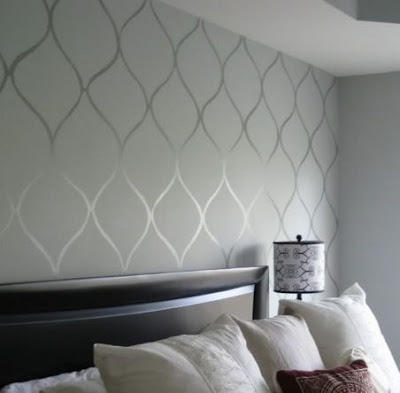
I like this tone-on-tone stenciled accent wall.
Then again, maybe I should just go for easy. This tutorial touts that characteristic. That seems more my style! Easy!
Would this be way to modern for my fairly traditional house?


No comments:
Post a Comment